Gerhard Richter
Gerhard Richter
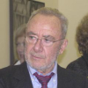
Gerhard Richteris a German visual artist. Richter has produced abstract as well as photorealistic paintings, and also photographs and glass pieces. His art follows the examples of Picasso and Jean Arp in undermining the concept of the artist's obligation to maintain a single cohesive style...
NationalityGerman
ProfessionPainter
Date of Birth9 February 1932
CountryGermany
ideas waiting danger
It is a danger to wait around for an idea to occur to you. You have to find the idea.
flower feelings gingerbread
How could one be in this world without feeling dismayed by it? Even if one paints flowers and gingerbread.
art real taken
Yes, we were amazed when that happened. It was a real joke to us. Konrad Lueg and I did a Happening, and we used the phrase just for the Happening, to have a catchy name for it; and then it immediately got taken up and brought into use. There's no defence against that - and really it's no bad thing.
art fun thinking
That was a piece I did in 1963 with Konrad Lueg in a department store, in the furniture department. It was announced in some papers as an exhibition opening, but the people who came didn't know that it was to be a sort of Happening. I don't think it is quite right that it has become so famous anyhow. It was just a lot of fun, and the word itself, Capitalist Realism, hit just right. But it wasn't such a big deal.
communication form
Without form, communication stops... without form, you have everybody burbling on to themselves, whenever and however, things that no one else can understand and - rightly - no one else is interested in.
art furniture form
I originally came from Dresden, where Socialist Realism prevailed. Konrad Lueg and I came up with it, for the most part ironically, since I now live in capitalism. It was certainly 'realism', but in another form - the capitalist form, as it were. It wasn't meant that seriously. It was more a slogan for that particular Happening at a furniture store.
religious art believe
Art is the pure realization of religious feeling, capacity for faith, longing for God. ... The ability to believe is our outstanding quality, and only art adequately translates it into reality. But when we assuage our need for faith with an ideology we court disaster.
art war feelings
I see the bomber pictures as an anti-war statement... which they aren't - at all. Pictures like that don't do anything to combat war. They only show one tiny aspect of the subject of war - maybe only my own childish feelings of fear and fascination with war and with weapons of that kind.
art important atlas
In the beginning I tried to accommodate everything there that was somewhere between art and garbage and that somehow seemed important to me and a pity to throw away. After a while, some sheets in the Atlas acquired another value, after all - that is, it seemed to me that they could stand on their own terms, not only under the protection of the Atlas.
art believe might
I believe that he knew more what he was doing. I might be absolutely wrong about this, but that was my impression.
art thinking expression
The grey is certainly inspired by the photo-paintings, and, of course, it's related to the fact that I think grey is an important colour - the ideal colour for indifference, fence-sitting, keeping quiet, despair. In other words, for states of being and situations that affect one, and for which one would like to find a visual expression.
art real want
Only about one per cent of my paintings show family members. Do they help me deal with problems? It's likely that these problems can only be depicted. But photographs, private ones and others, keep appearing that fascinate me so much that I want to paint them. And sometimes the real meaning these images have for me only becomes apparent later.
art illustration ideas
I first came up with the idea for the colour-chart pictures back in 1966, and my preoccupation with the topic culminated in 1974 with a painting that consisted of 4,096 colour fields. Initially I was attracted by the typical Pop Art aestheticism of using standard colour-sample cards; I preferred the unartistic, tasteful and secular illustration of the different tones to the paintings of Albers, Bill, Calderara, Lohse, etc.
art blue yellow
Turning to the colour-classification methodology: The starting point are the four pure colours red, yellow, green and blue; their in-between shades and scales of brightness result in colour schemes containing 16, 64, 256 and 1,024 shades. More colours would be pointless because it wouldn't be possible to distinguish between them clearly.