David Carson
David Carson
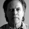
David Carsonis an American graphic designer, art director and surfer. He is best known for his innovative magazine design, and use of experimental typography. He was the art director for the magazine Ray Gun, in which he employed much of the typographic and layout style for which he is known. In particular, his widely imitated aesthetic defined the so-called "grunge typography" era...
NationalityAmerican
ProfessionDesigner
Date of Birth8 September 1954
CountryUnited States of America
I think we've seen a lot of examples of giving a name its own definition in the dot-com world. Amazon, Google, Yahoo - these are names we never would have dreamed major corporations would choose.
I did an early version of my site where it was virtually impossible to get through it, just as a statement about the web. But after a few laughs and some angry e-mails, I realized it wasn't doing me much good. I think the web has become more about the final product, not what it takes to get to it.
I'm experimenting in public. At the design grad schools, these are people sitting around in groups, putting their work on a wall, analyzing it and putting it back in a drawer. I think there's little risk in that.
Having done a lot of magazines, I'm very curious how big magazines handle big stories, and I was very curious to see how 'Time' and 'Newsweek' would handle 9/11. And I was basically pretty disappointed to see that they had chosen to show the photo we'd already seen a million times, which was basically the moment of impact.
My site is a little unorthodox without being totally inaccessible.
The dreaded phrase in design circles is 'show and tell.'
Just because something's legible doesn't means it communicates. More importantly, it doesn't mean it communicates the right thing. So, what is the message sent before somebody actually gets into the material? And I think that's sometimes an overlooked area.
As we get more technically driven, the importance of people becomes more than it's ever been before. You have to utilize who you are in your work. Nobody else can do that: nobody else can pull from your background, from your parents, your upbringing, your whole life experience.
Some people hate lime-green; red has all this emotional baggage. Blue seems to be overall one of the more positive colors, and a little more serious than yellow.
My background is sociology. Combined with my graphic approach, if I could do some film projects, I think I'd be very good at making documentaries eventually, but people don't think of me for that, of course. But dialogue is something I know I can be good at.
Good things are associated with blue, like clear days, more than singing the blues. Just the word 'blue' in the singular is full of optimism and positive connotation to most people.
I'm a big believer in the emotion of design, and the message that's sent before somebody begins to read, before they get the rest of the information; what is the emotional response they get to the product, to the story, to the painting - whatever it is.
If I'm doing a logo, I'll do it in black and white. Once the form is feeling right, only then do I start exploring the color palettes. A good example was the process of rebranding the Salvador Dali Museum. I did at least 100 versions in black and white.
The school system cannot single-handedly rid Roanoke city of poverty or the effects of poverty.